
pt/br:
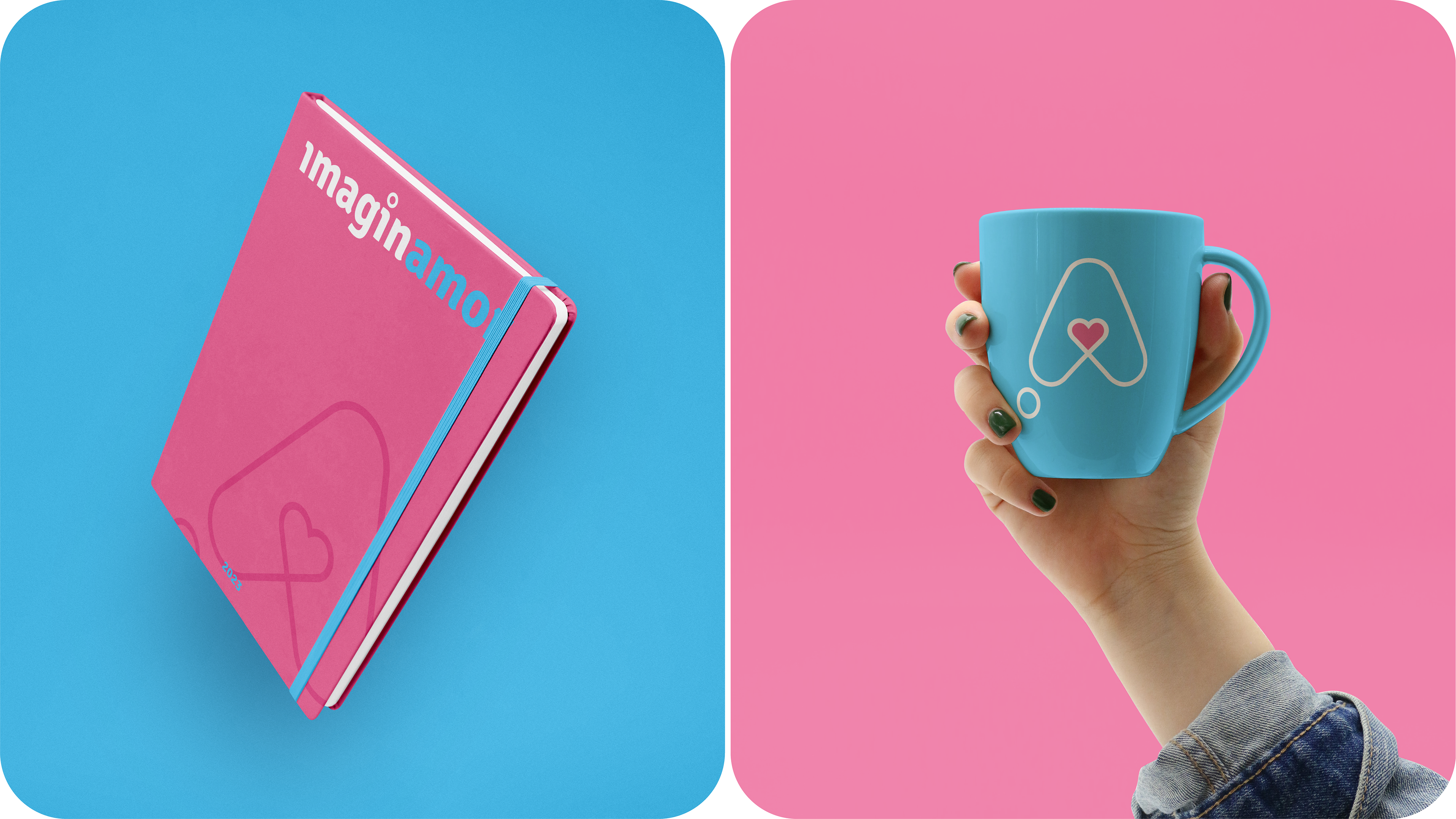
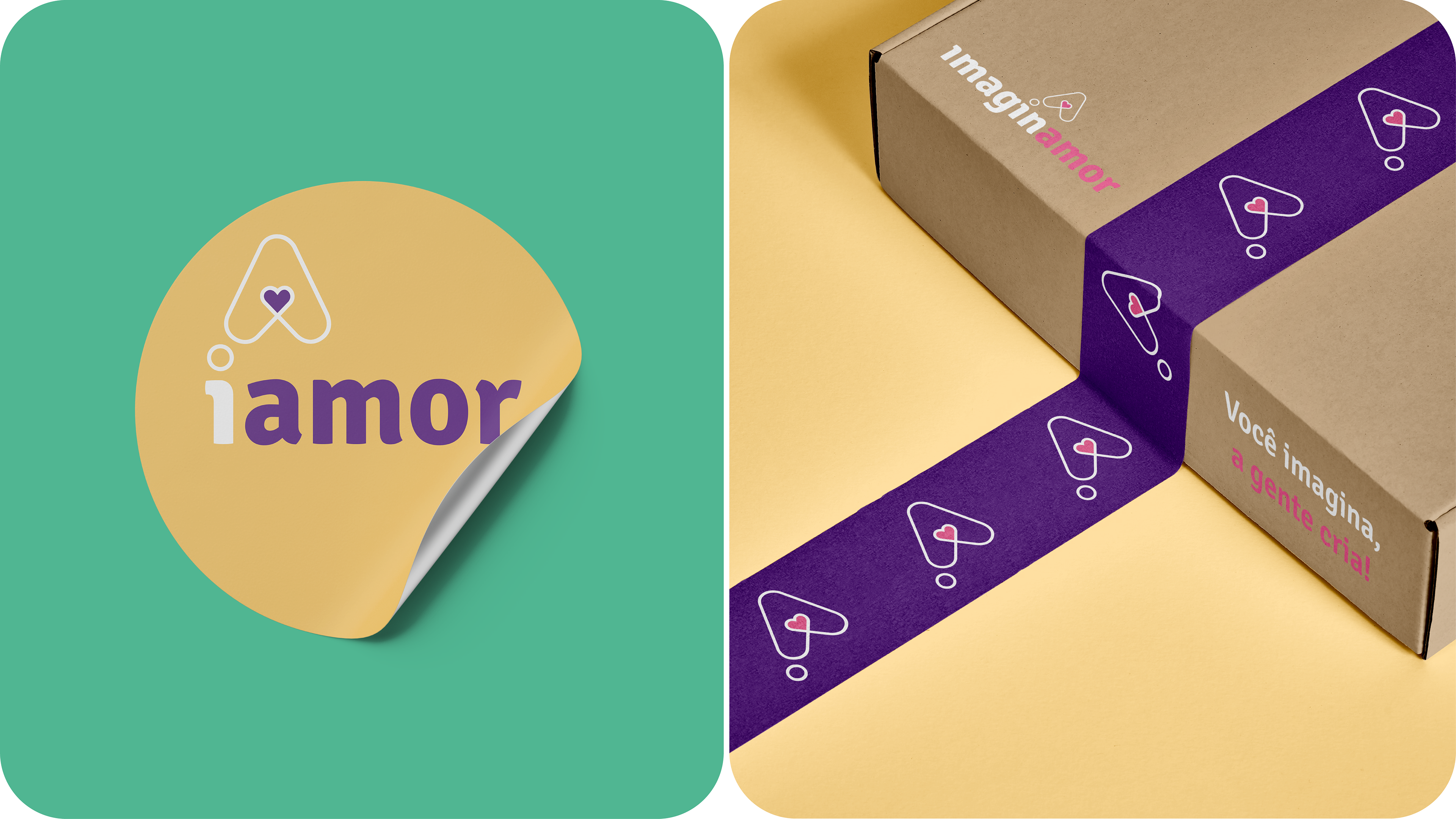
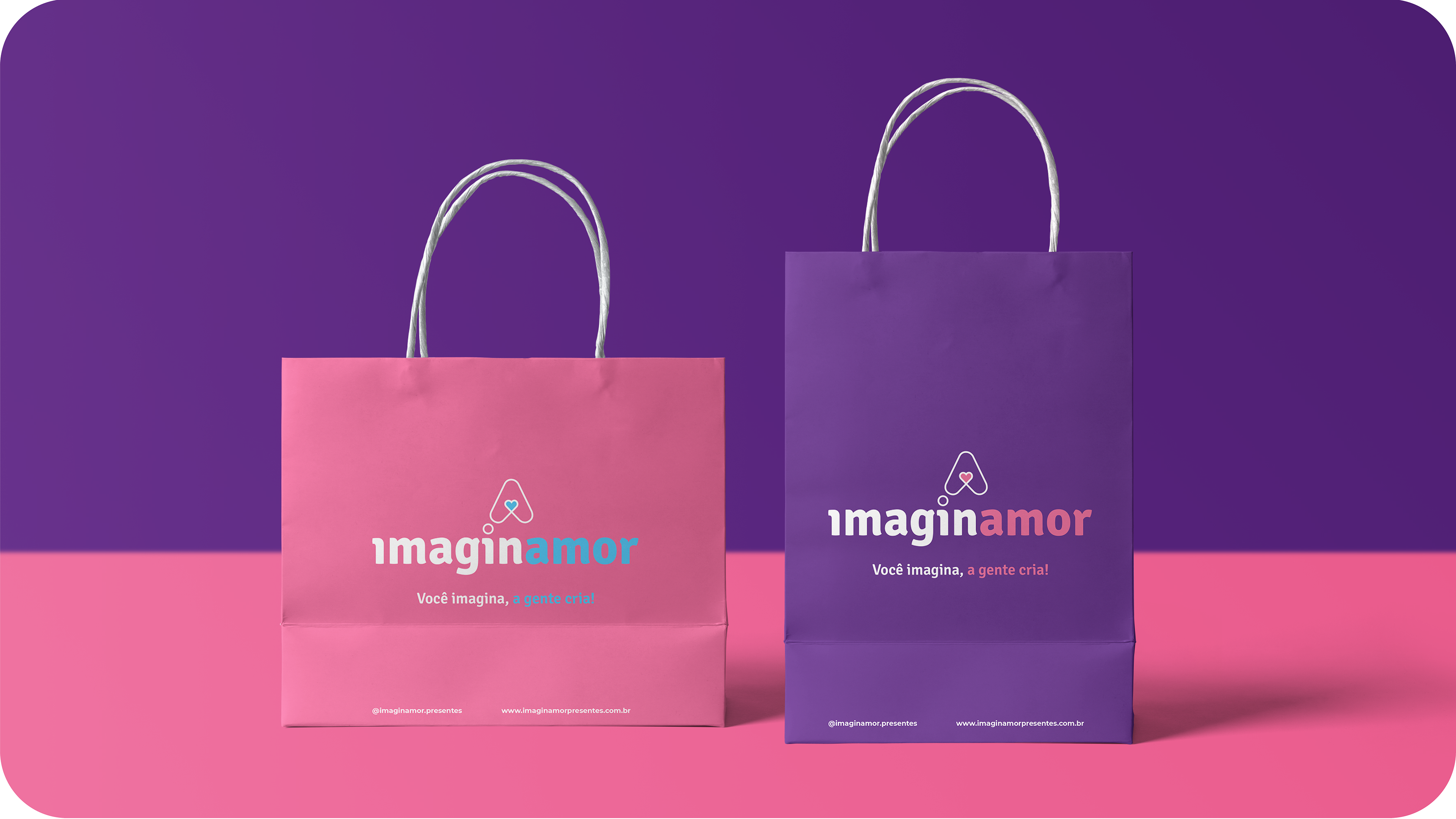
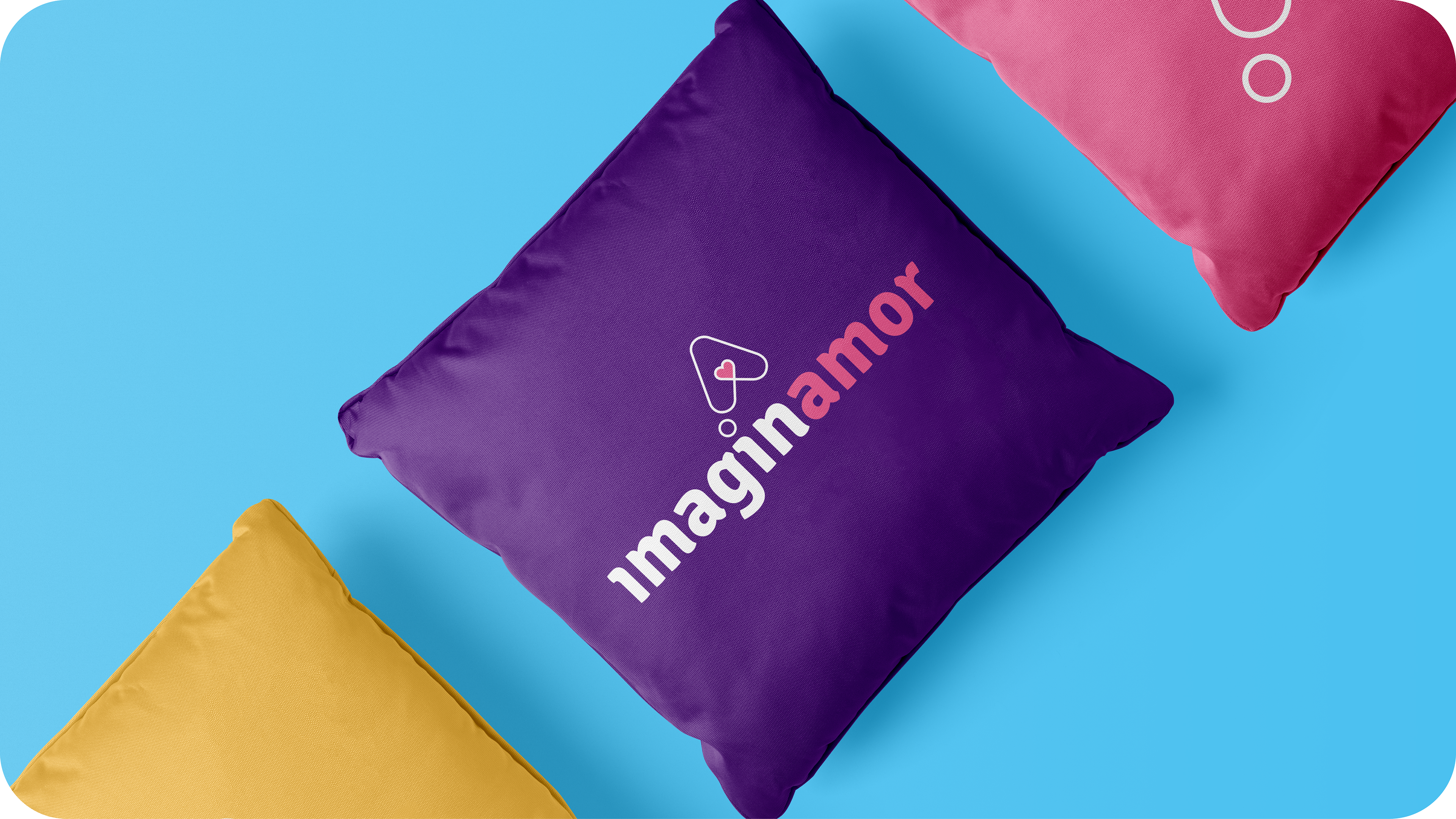
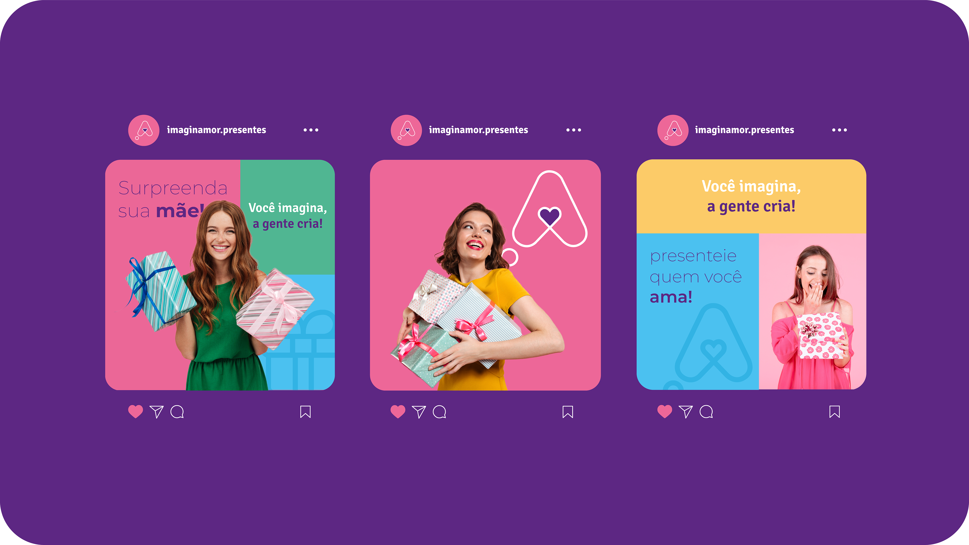
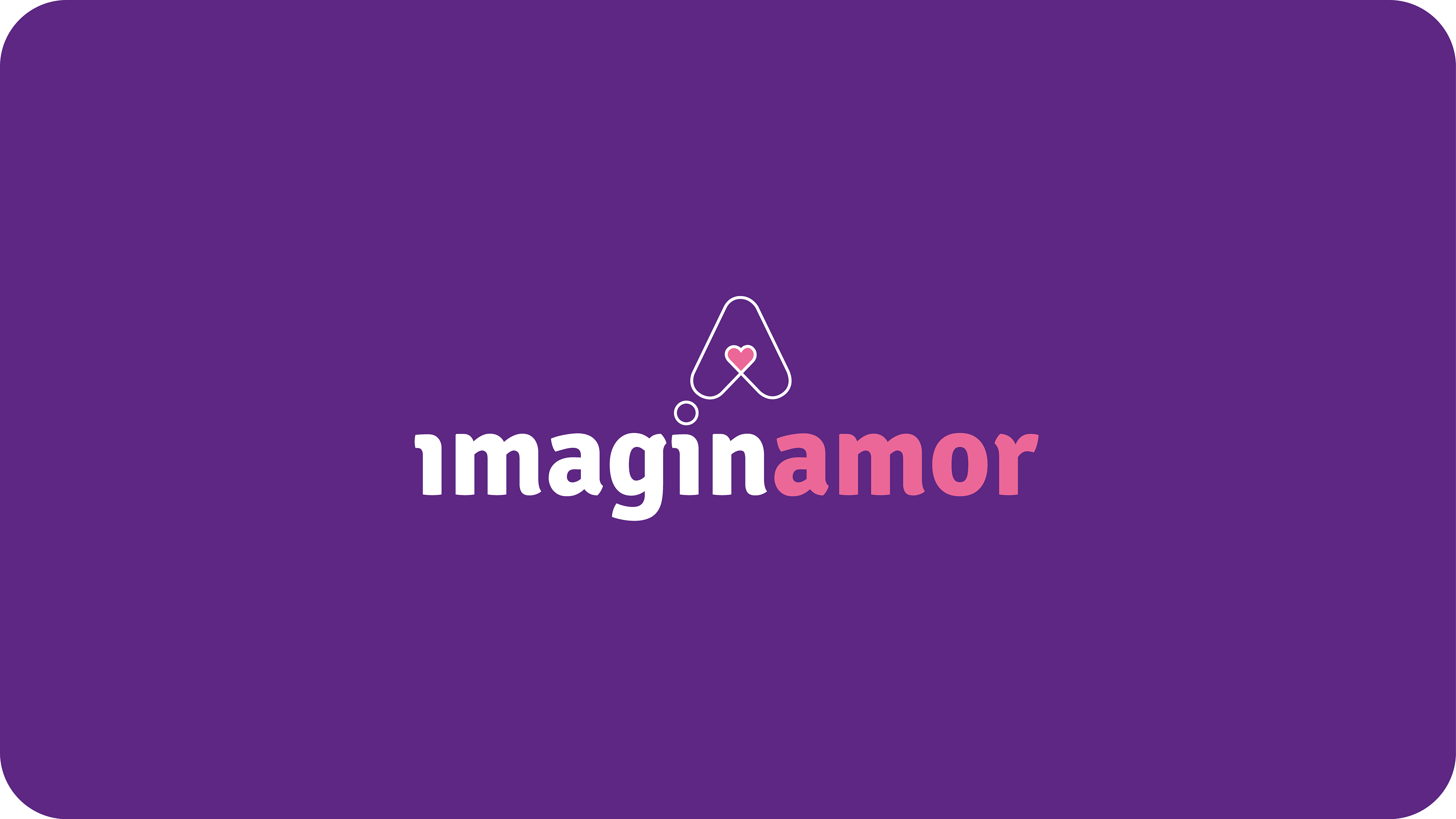
Imaginamor é uma nova loja online que vende diversos presentes personalizados, como: canecas, cestas, camisetas e muito mais. Seu grande diferencial das concorrentes do seu segmento é a qualidade máxima em seus produtos, entrega rápida e em todo Brasil e atendimento exclusivo para fazer presentes sob medida e para todas as ocasiões.
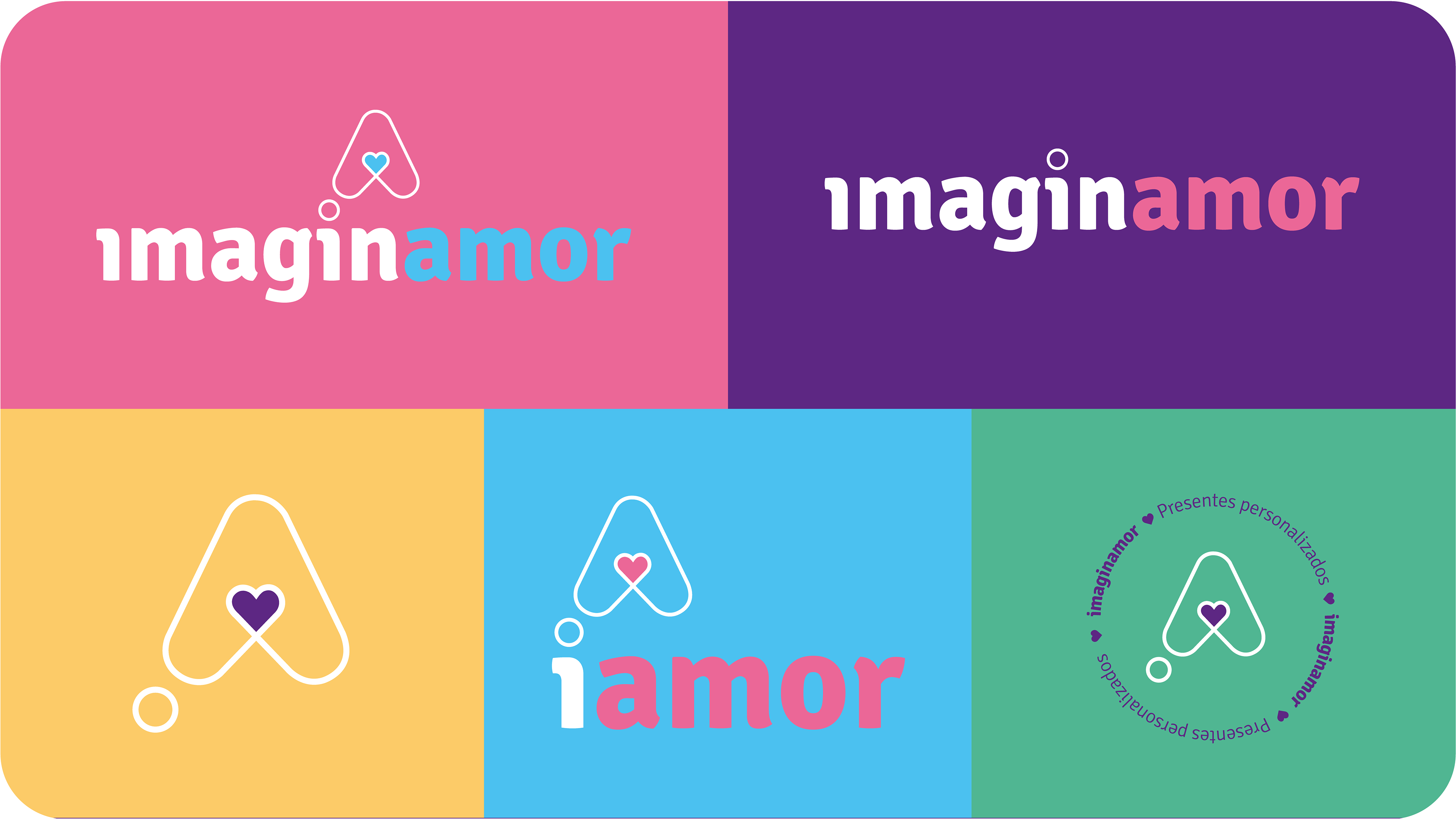
O nome Imaginamor, teve como referência do inglês "Imagin" de imaginar, com a junção da palavra "Amor", e também de "imaginar o amor" fazendo alusão de imaginar ganhar algo especial que a gente ama de uma pessoa.
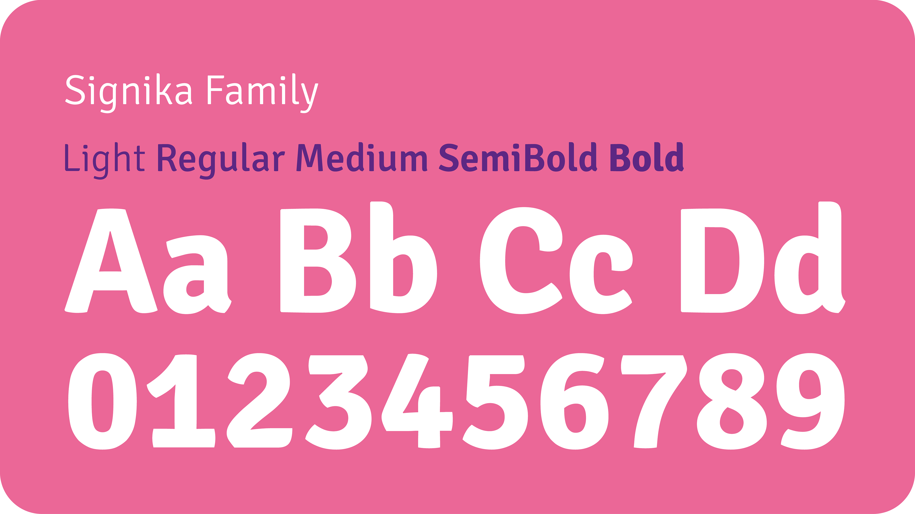
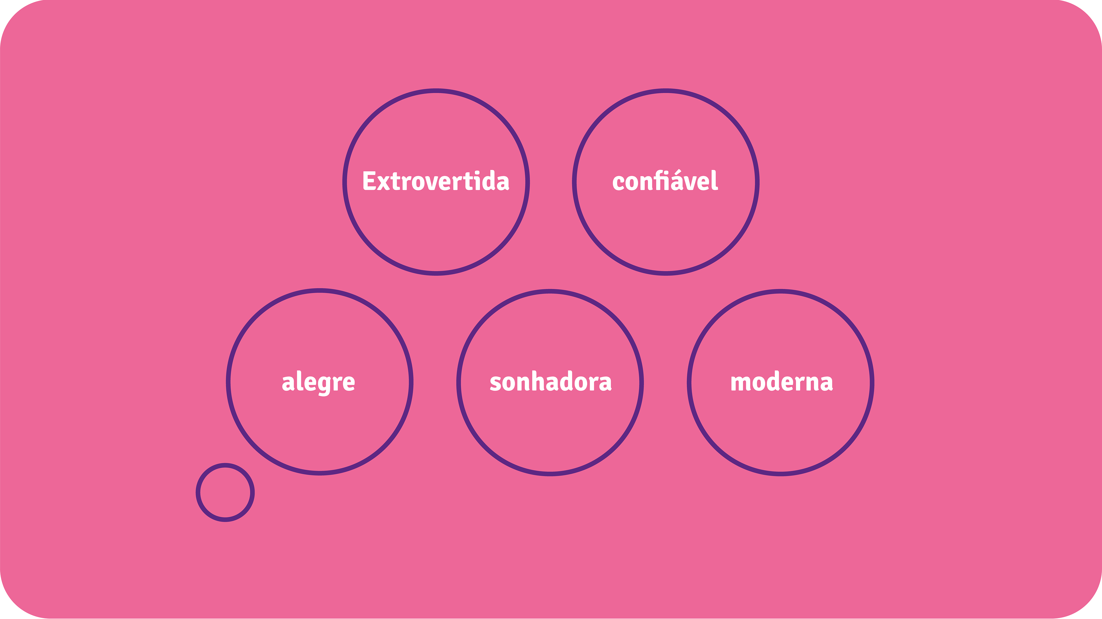
A identidade visual precisava ser criativa e diferente de tudo nesse segmento, que comunicasse de forma simples, atrativa e moderna. A fonte usada é leve e alegre e comunica de forma confiável, o ícone desenvolvido traduz o significado do nome e é um elemento para ser usado estrategicamente pela marca e as cores usadas trazem o significado de amor, alegria, confiança, modernidade e criatividade da marca.
en/us:
Imaginamor is a new online store that sells a variety of personalized gifts, such as: mugs, baskets, t-shirts and much more. Its big differential from competitors in its segment is the maximum quality of its products, fast delivery throughout Brazil and exclusive service to make custom-made gifts for all occasions.
The name Imaginamor, had as reference the English "Imagin" to imagine, with the junction of the word "Amor", and also of "imagining love" alluding to imagining getting something special that we love from a person.
The visual identity needed to be creative and different from everything else in this segment, communicating in a simple, attractive and modern way. The font used is light and cheerful and communicates reliably, the icon developed translates the meaning of the name and is an element to be used strategically by the brand and the colors used convey the meaning of love, joy, confidence, modernity and creativity of the brand .

pt/br:
Para o desenvolvimento do ícone da marca, foi usado o ícone do "coração" como referência, as partes de cima arredondada foi ampliada, repetida e diagramada para dar construção ao projeto.
en/us:
For the development of the brand icon, the "heart" icon was used as a reference, the rounded top parts were enlarged, repeated and diagrammed to give construction to the project.